Back in February, I mentioned that I had to change directions on the artwork for Incarnation and that I would post some details about it. So, here’s the long—but hopefully interesting—story.
When I began working on Incarnation, the first novel in the Wandering Starsseries, I knew I wanted to have artwork that was as compelling as the story I hoped to write. And while I had created the artwork for the first three Awakened books myself, I slowly came to realize that my artistic abilities weren’t up to the task. Meanwhile, I was struggling to balance all the various aspects of my fledgling career as an author. Time was quickly becoming a precious resource. So, I decided to look for an artist.
A web search turned up an interesting online community called deviantART, where artists of every discipline, from photography to sculpture, post their work and the work of others who inspire them. Being an international community, the breadth of styles and vast number of artists were staggering. But I was confident that somewhere out there was an artist who was capable of capturing my vision. And after viewing—literally—thousands of pieces of art, I came across the gallery of albino-Z.
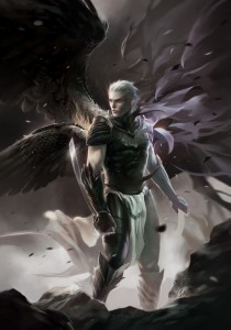
His style of gritty realism, mixed with ethereal fantasy was perfect for what I wanted to convey. I contacted him for a quote and quickly hired him to do the artwork. For the next several weeks we traded numerous emails, working out the visual details of the world I was creating for this new series, and how to capture that on a book cover. At the time, I was inspired by some of the artwork that can be found on video games in the military genre. Naturally, I steered the project in the direction of portraying my main character—Sariel. Somewhere along the line, I received some brilliant objective input about the cover concept, which led me to think very carefully about the scope of what I was trying to capture with the cover artwork.
One of the most surprising things to me about the success of the Awakened novels has been their acceptance among a wide demographic. Despite the fact that I intended to write something for males, age 20 to 40, I’ve received many encouraging notes from readers ranging from middle-schoolers to retirees…of both genders. With this in mind, I took another look at the artwork for the Awakened and I realized that its symbolic approach is probably more appealing to a wider audience than a literal perspective.
…which brought me back to Incarnation.
Although the quality of artwork was incredible, and the piece was turning out just as I wanted—visually stunning—I realized my overall concept would only capture a narrow snapshot of the story. I had some decisions to make…and fast! I notified albino-Z that I might need to go another direction. Then, my amazing wife coordinated a brainstorming session with a group of friends who are artists, photographers, and creative thinkers for the purpose of developing a higher-level art concept that would apply to the entire Wandering Stars series. It was awesome and turned out to be really successful. In the end, what we came up with was a rough, symbolic concept that would capture the look-and-feel of the whole series as I saw it in my mind. At the same time, each book cover would be a unique piece of art that had a place among the overall collection.
With this new direction identified, I asked albino-Z to finish the original piece so that I could perhaps use it in another way (as concept art, or for a graphic novel?). At the very least, I wanted to frame it and hang it in my office.
Before I move on with the rest of the story, here’s the amazing completed piece from an artist with talent way beyond my own!
I would encourage anyone looking for an artist to provide cover artwork, either character or landscape-based, to visit albino-Z’s gallery on deviantART and visit his page on Facebook. It was truly a pleasure working with him and I hope that I have the opportunity to do so again!
On with the story…
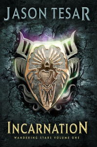
After identifying a new concept for Incarnation, I started working with one of the artists from the group brain-storming session who specializes in photo-illustration and motion graphics. Mike Heath, owner of Magnus Creative, walked me through a few iterations of sketches to arrive at just the right symbolic imagery that would capture the human and angelic cultures involved in Incarnation. After creating something we were both happy with, Mike proceeded with modeling the artwork using a 3D rendering process.
The results were breathtaking and I instantly knew that I’d made the right choice for this novel, as well as the series.
While there still may be some adjustments on the text elements (title, series name, and author’s name), I’m pleased to present the cover artwork for Incarnation: Wandering Stars Volume One.
I’m so pleased with the artwork that I now hope to achieve the same level of quality with my writing that Mike was able to achieve with the art. My experience with Magnus Creativewas awesome and I’m looking forward to the projects that we will be able to collaborate on in the future. Please visit Magnus Creative online and contact Mike if you, or anyone you know, has needs in the areas of photo-illustration, motion-graphics, or 3D rendering.


